


Dynamic contents!
 WordPress Plugin
Media Grid is an unique tool to create unlimited responsive, filterable, paginated portfolios with ease. Using advanced CSS and javascript techniques allows you to create your own layouts and adapt them to any container.
Unique means not repeatable by any tool: forget about fixed rows or schemes, here your creativity can be fully exploited.
Worried about representation of your setup on small screens? There’s a smart system swapping automatically to a simpler and mobile optimized mode: lighter images, touch-proof sizes and dynamic control on overlay elements. Everything will be always displayed perfectly.
Finally, plugin integrates each item with the most popular social networks (Facebbok, Twitter, Pinterest and WhatsApp) giving a better sharing system, focused on real item contents!
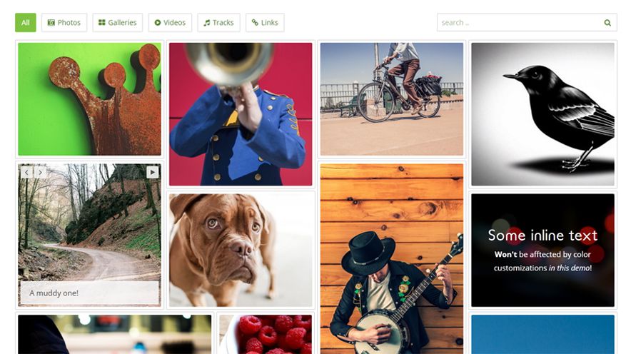
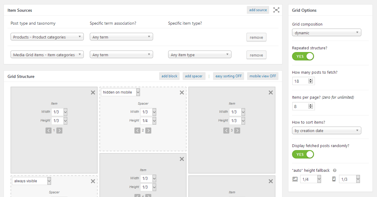
Everything gravitates around visual grid builder: the real plugin’s core where you can create your amazing layouts.
Choose among a wide sizes variety to shape up your portfolios: it shows your changes in real time, representing a real advantage in projecting phase!
Media Grid is extremely versatile and features 14 different item types to compose your portfolio:
Simple static image without lightbox
And of course the “spacer” item to help you creating awesome layouts.
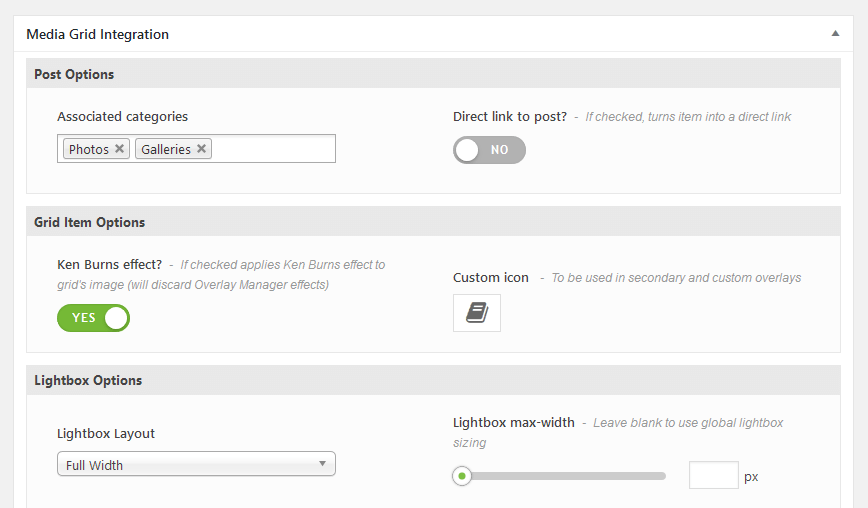
Each one having its custom options to be shown as you need. For example the Ken Burns effect in grid context, or also the image zoom for single image.

Do you already have a lot of contents and don’t want to lose time creating items?
You can compose grids also with them!
Media Grid supports any public post type (eg. posts or WooCommerce products) ready to be included from visual grid builder. They will be dislayed as “single image” items, with associated lightbox, or also as direct link to their original page.
Plus, every post can be tuned through several options, as you do with Media Grid items. Can be also associated to grid categories to be filtered!
Want to use your WP Media Library images? For sure!
It’s the quickest way to use the plugin as a gallery engine.
The plugin is not only unique because of its grid layout system, but also because of its lightbox! Allowing shortcodes, HTML and javascript usage to fill it with virtually any content you need to show (eg. a slider or media player)
Featuring two main modes:
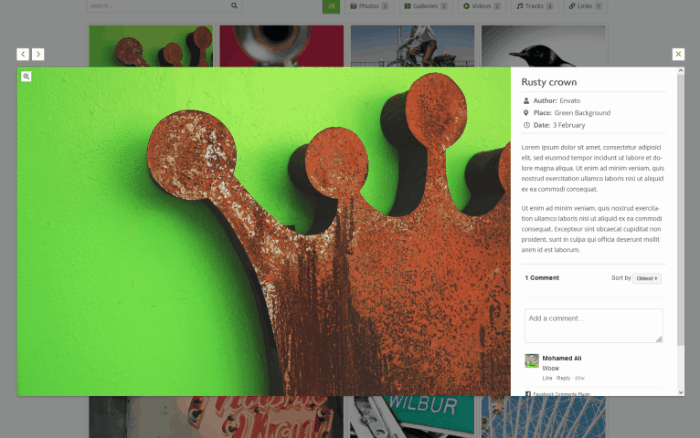
A lot of things are hidden under Media Grid lightbox: it is not only completely managed by lightweight CSS code but also optimized to let search engines find contents with ease.
The best way to keep everything fast and clean is to use AJAX calls, but normally it is against best SEO practices. Media Grid goes beyond this, using HTML5 functions to create true URLs for each element: lightbox, filters, pagination and even item searches. Everything autonomously, without third-part solutions!
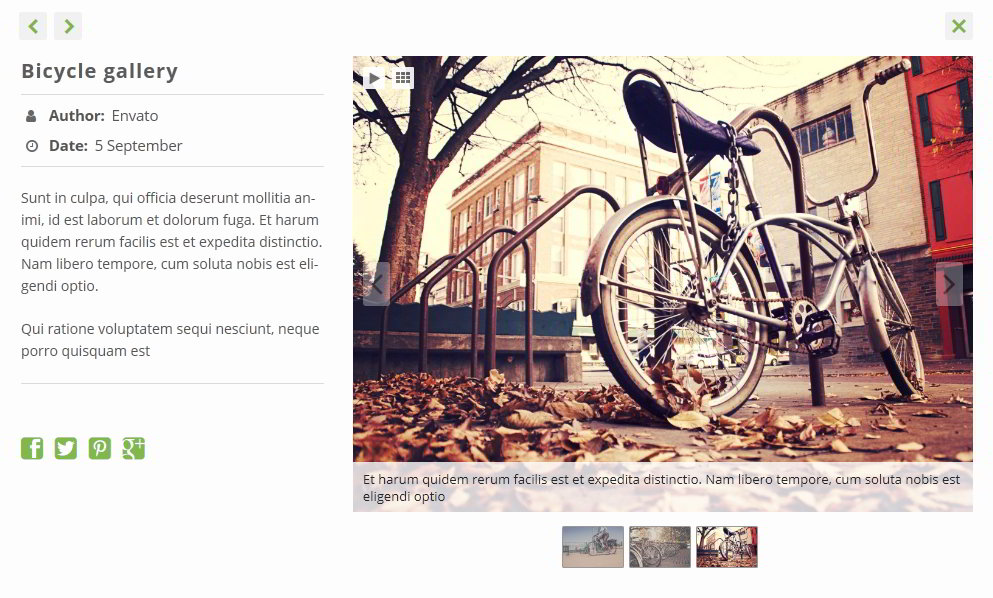
Try these two links related to the grid on the bottom of this page: “Galleries” filter “Bicycle gallery” item
But there’s more: Media grid offers also a special XML file to be used in specific SEO systems such as Google Webmaster Tools. Containing item links and associated featured images to push contents indexing as fast as possible!


Media Grid offers 6 different pagination solutions: from simple arrows to numbered buttons to infinite scroll! But, why is a “SEO friendly” pagination?
Item details are all loaded in the page, but only search engines will be able to completely index your awesome items. Pagination is also tracked by deeplinking system, so you can share a specific grid page.
This means no impact on page’s loading speed and at the same time a great advantage on the web!
Are you not familiar with web sizes, margins or colors? Don’t have time to manage each plugin setting?
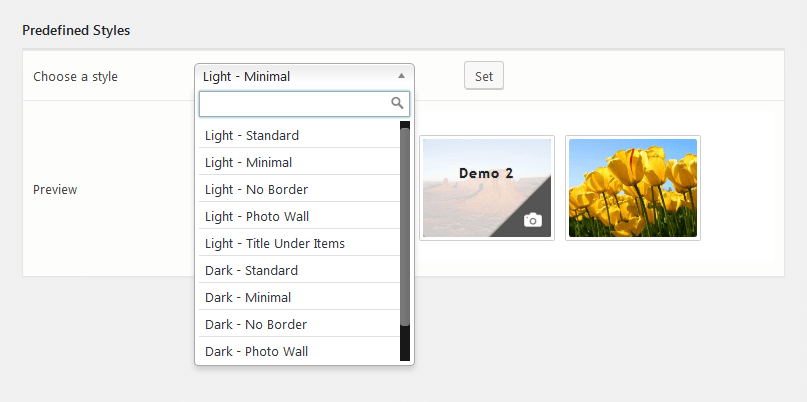
No problem, the plugin is ready to be used out of the box and has got 10 preset styles you can enable just with one click!
Just choose what you like the most from the wizard and let Media Grid do the rest.
Once set, the style can be customized in any aspect: maximum simplicity and flexibility!
Once you’ve created grids, using them in your website is simply as use the native WordPress builder block (or the shortcode wizard, located on top of any wordpress editor).
Choose the grid, the pagination system, whether to display filters, their position and choose whether to use items search system.
You can even decide to hide the “All” filter or to select a default filter that will be applied on grid’s loading.
Move item texts under featured image in two modes: attached or detached from item.
Finally you can override global grid styling: setting custom margins, borders and border radius on the fly!
Seamlessly integrated, Media Grid is a perfect solution also to create WooCommerce products showcases.
No complex processes: everything will be managed as a native item, supporting both single/multi image products. As native items they can be customized and mixed to other item types with no change at all to the WooCommerce core.
Also product attributes and ratings are fetched and perfectly integrated in plugin systems.
Finally, Media Grid lightbox features a smart “add-to-cart” button: ajax-driven, supports quantity and variable products!


You can easily find items with the integrated searching system: it is based on items title and works in real time, without delays!
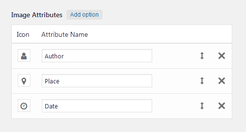
Are titles too limitated? Use the search helper, in items editor, to add indexed words and add a semantic touch to searches!
“guitar play concert event” words have been used for “SoundCloud track” item, in the main demo: give a try!
Optionally searches and filters are also performed through pages.
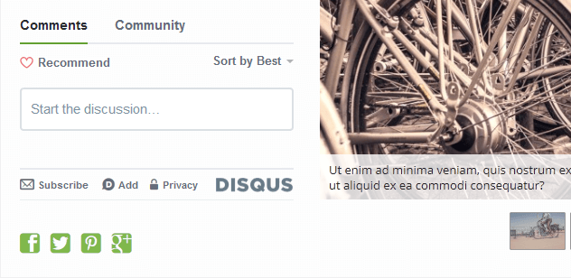
Engage visitors and know what they think about your products!
Media Grid, thanks to its deeplinking engine, integrates with Disqus and Facebook Comments: probably the best social tools to get and manage comments seamlessly.
Obviously this feature is totally optional, you can also disable comments for specific items.
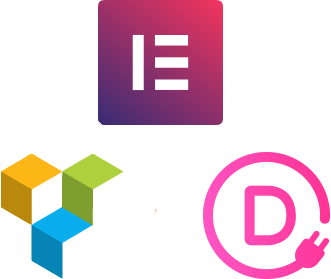
Stop wondering what hides behind complex shortcodes and start using real-time previews! They are the state-of-the-art of modern wordpress page building, speeding up development.
The plugin natively integrates with Elementor, WPBakery Page Builder and Divi Builder, to give you the best user experience available today on wordpress.
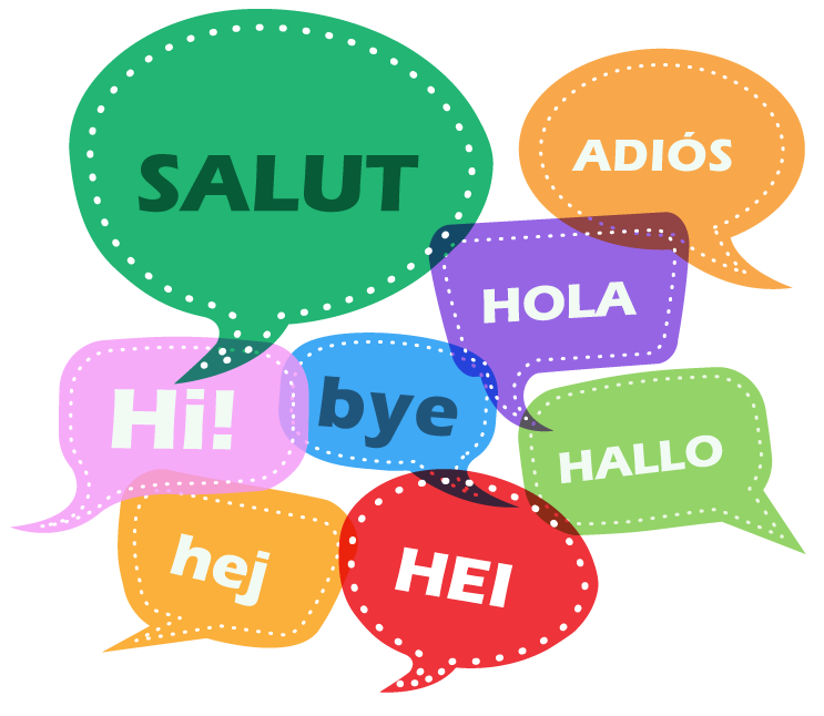
Media Grid is also completely translatable on both front and back ends.
You will be able to localize it creating your .po file, using WPML or Polylang.
Yes, it has also the WPML multilingual certification and has been tested to work seamlessly with it!
As per LCweb’s philosophy, plugin’s strong point is customizability. Every aspect of grid items and lightbox can be changed to match the look and feel you need!
Be amazed reading the complete features list or checking settings screenshots
Unlimited colors, margins, paddings, borders, sharing icons styles, filters position and colors. Four item’s navigation styles, six lightbox navigation styles, five lightbox content layouts, three lightbox entrance/sliding effects, 16 CSS3 loaders, full typography control: are only a bit of what you can manage. Everything easily, with few clicks.
Try few of the many possible customizations in the following example:


Won’t be afftected by color customizations in this demo!